(Week19) DEALING WITH CAP
SUMMARY:
- CAPPY NOT CRAPPY -The bottle cap should look more ... convincing.
- TEXTURE EXPERIMENT- A different style wood turned out pretty but is it a fit?
- PLACING BOUNDARIES - An experiment with wooden arches in gameplay yields interesting results
- BUG WEBSITE MAKEOVER - Our game's main site is getting a fancy facelift but it is better?
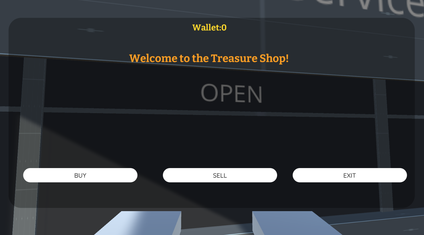
- STORE WALLET - We made a bigger UI for it so it's easier to see your profit margins
- TASK TRACKER GOLD IN 2 WEEKS- So close to the finish line.
PUTTING A CAP IN IT
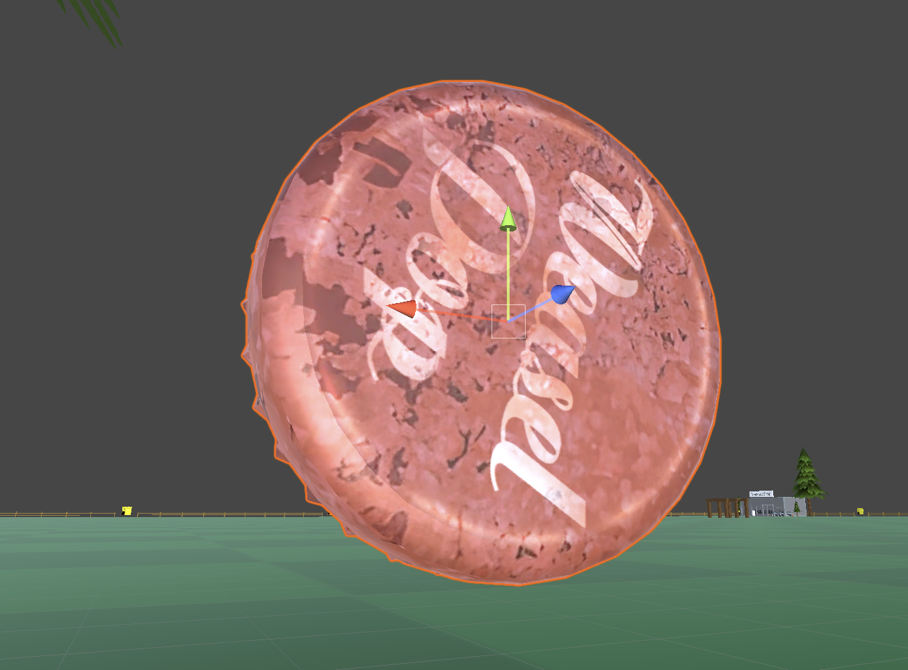
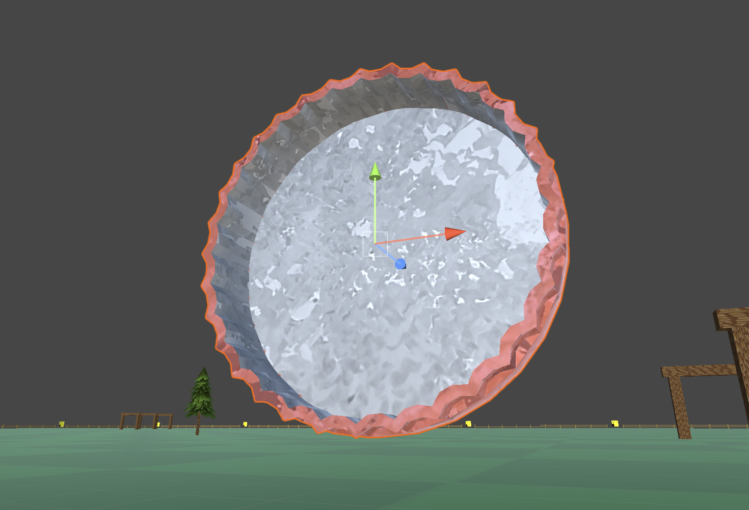
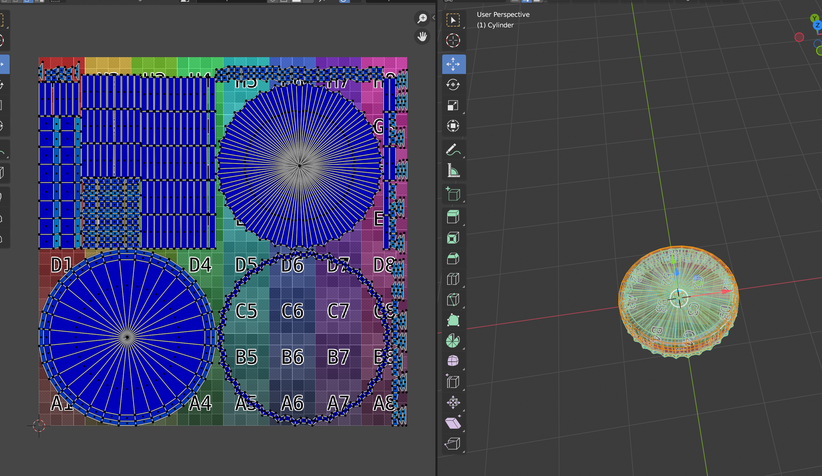 This week we obsessed over the bottle cap in our game. It needed some love. So we ventured into detailing it a bit
more to keep it authenic, wilst learning to get used to Blender3D's amazing tools in spite of a bewildering UI.
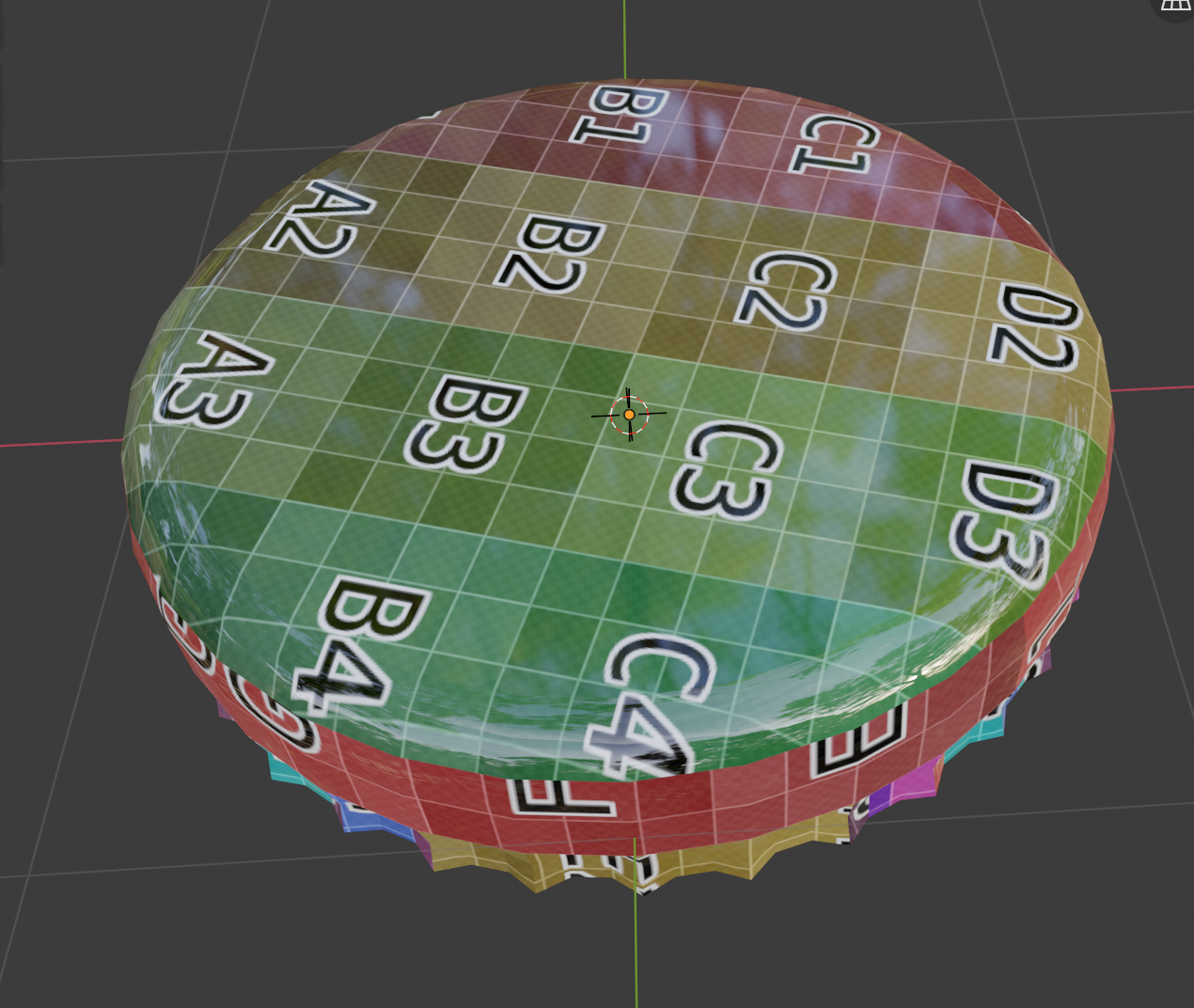 We added detailed the ridges and improved UV layout where it tapers under the dome. It may be a higher poly count but felt worth it.
It's a reminder how much more game we'll get once all the models are in for various metals and misc items in the coming weeks.
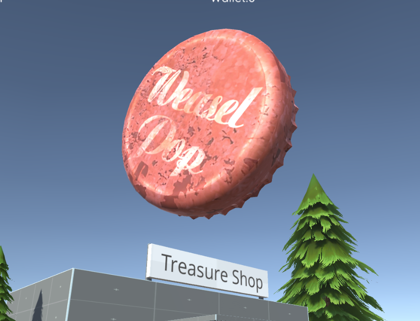
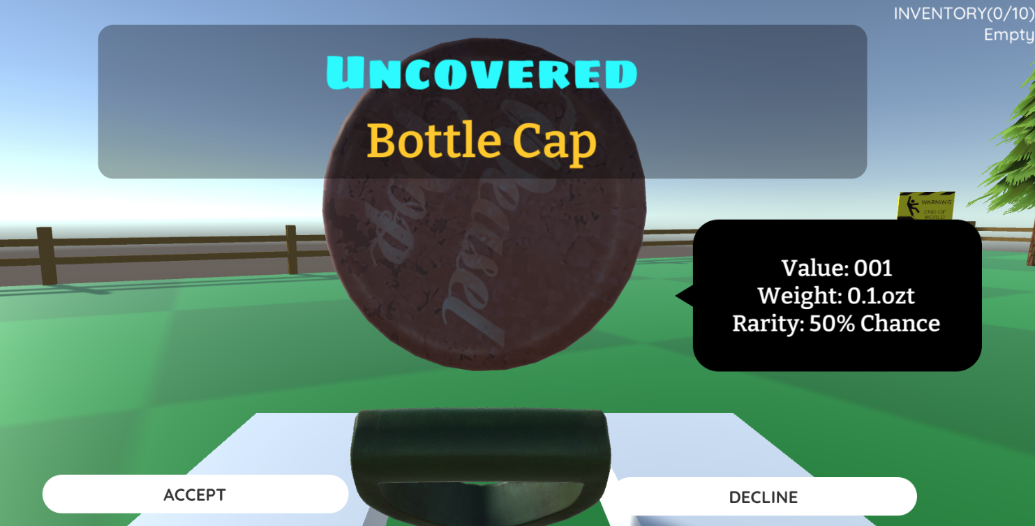 Last week we talked about the top 10 most common things found in parks and nature areas by metal detector enthusaists.
You can count on that being our main guide for models to come along
with updated store mechanics. So much to do, so little time.
TEXTURE EXPERIMENT
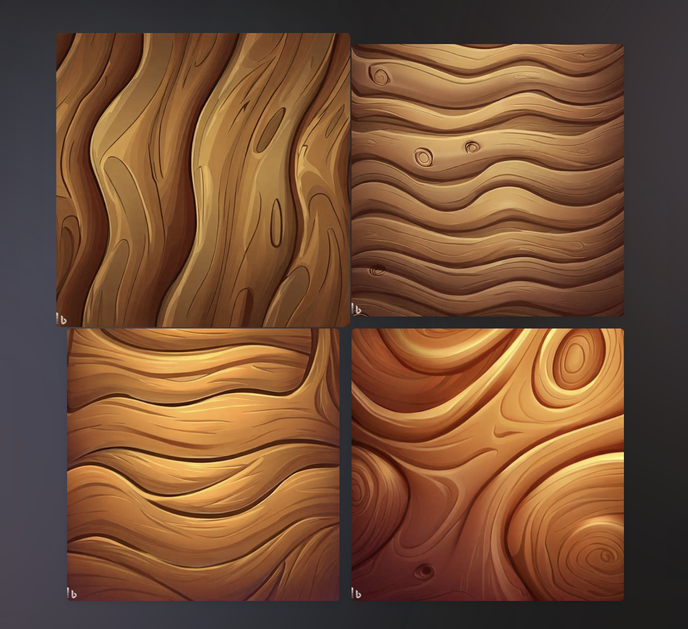 We also experimented with a different style of texturing for the game. Strattling between realism and style isn't easy.
While these are fun to look at, a bit of pixelation and squareness with emphasis on realistic hues and brightness may be the key to our
game's art direction.
PLACING BOUNDARIES
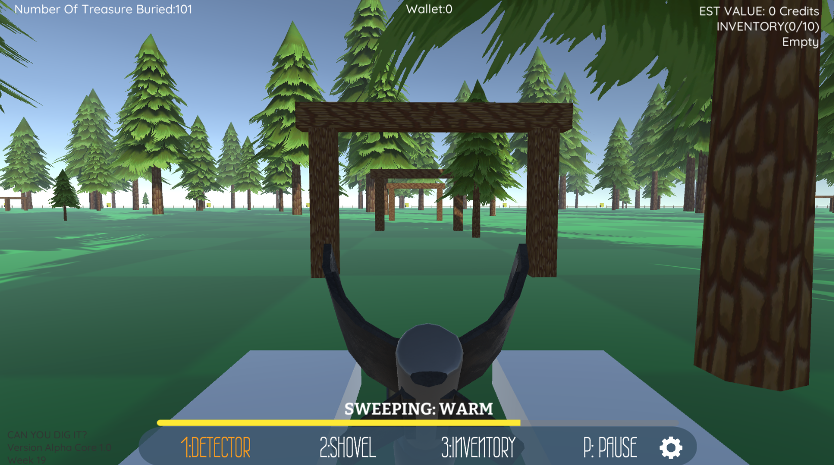
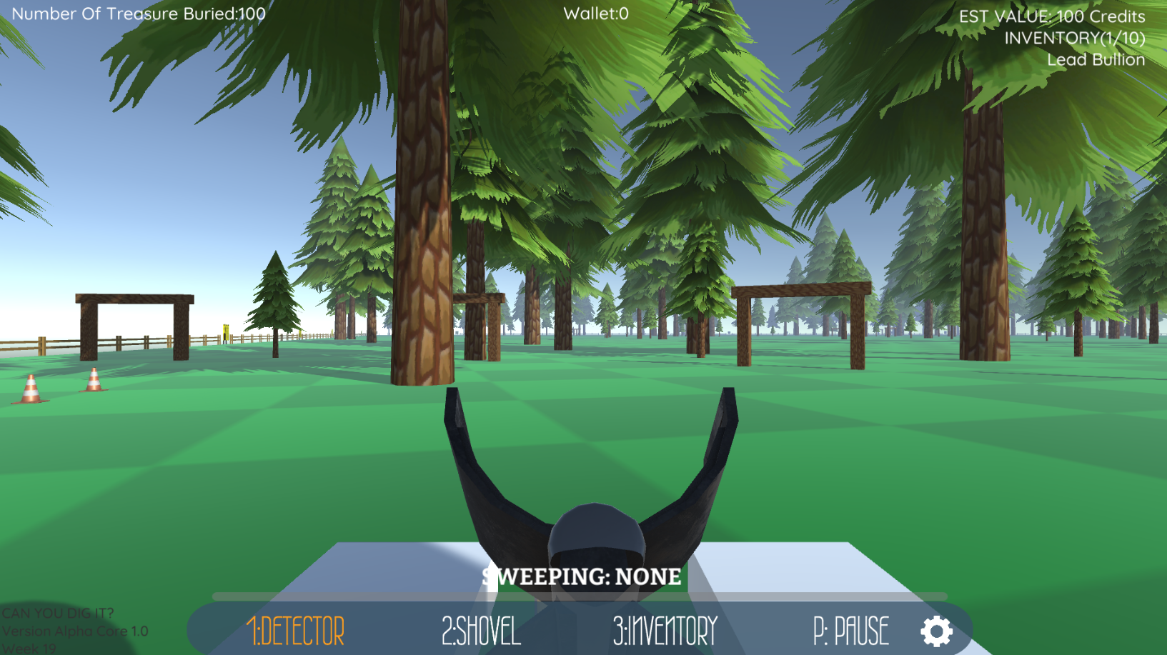 Some experiments were done with arches from what we talked about in previous weeks. In the latest build you'll notice they surround you at the start.
This was for fun as well as to experiment with the psychological effect of placing a boundary between oneself and the park's wilderness, like a gateway about to usher
you into the unknown.
STORE WALLET
We also removed the main game's UI from the store and made a custom one. Here you can see the "WALLET" appear at the top. The store will get a major makeover soon enough but for now it made sense to make sure it was clear how much you're winning!
BIG WEBSITE MAKEOVER
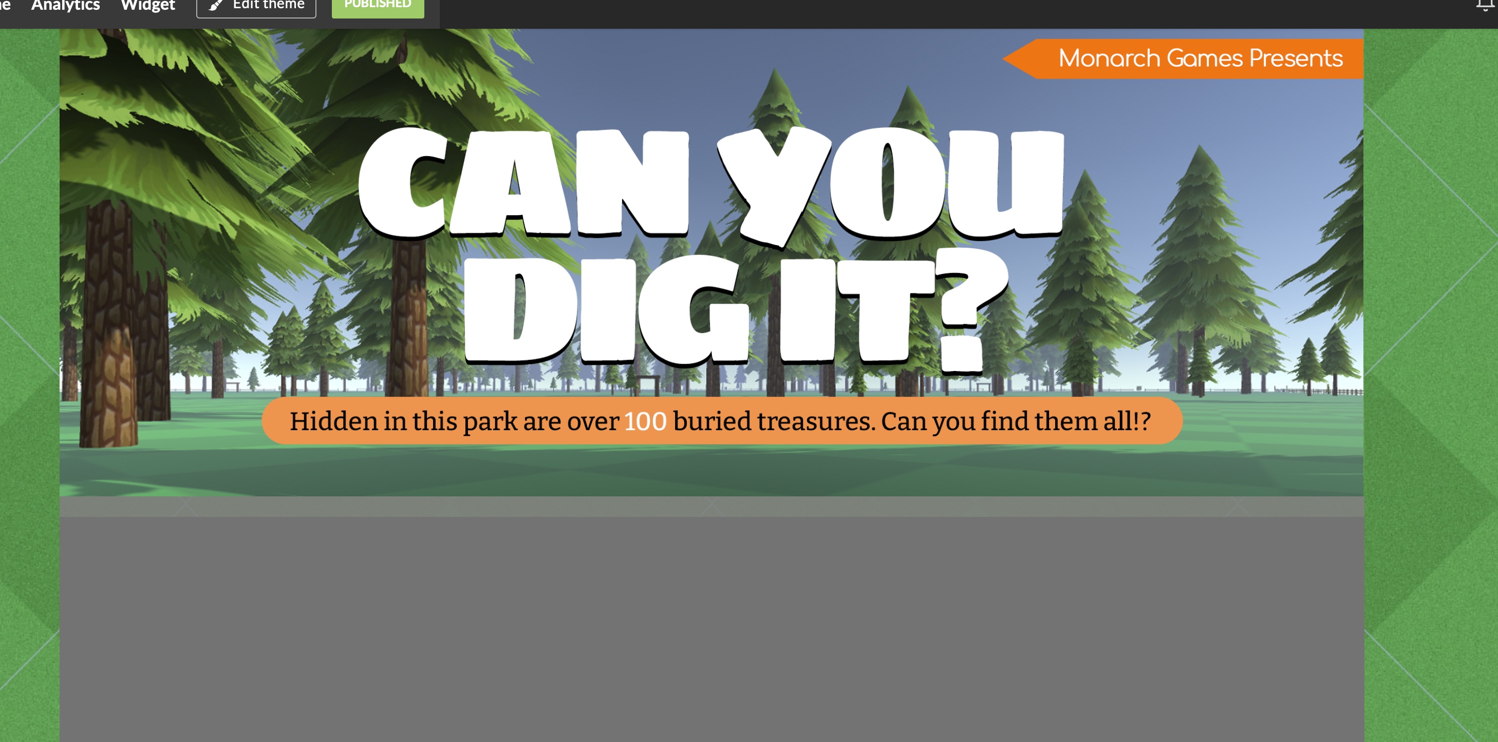
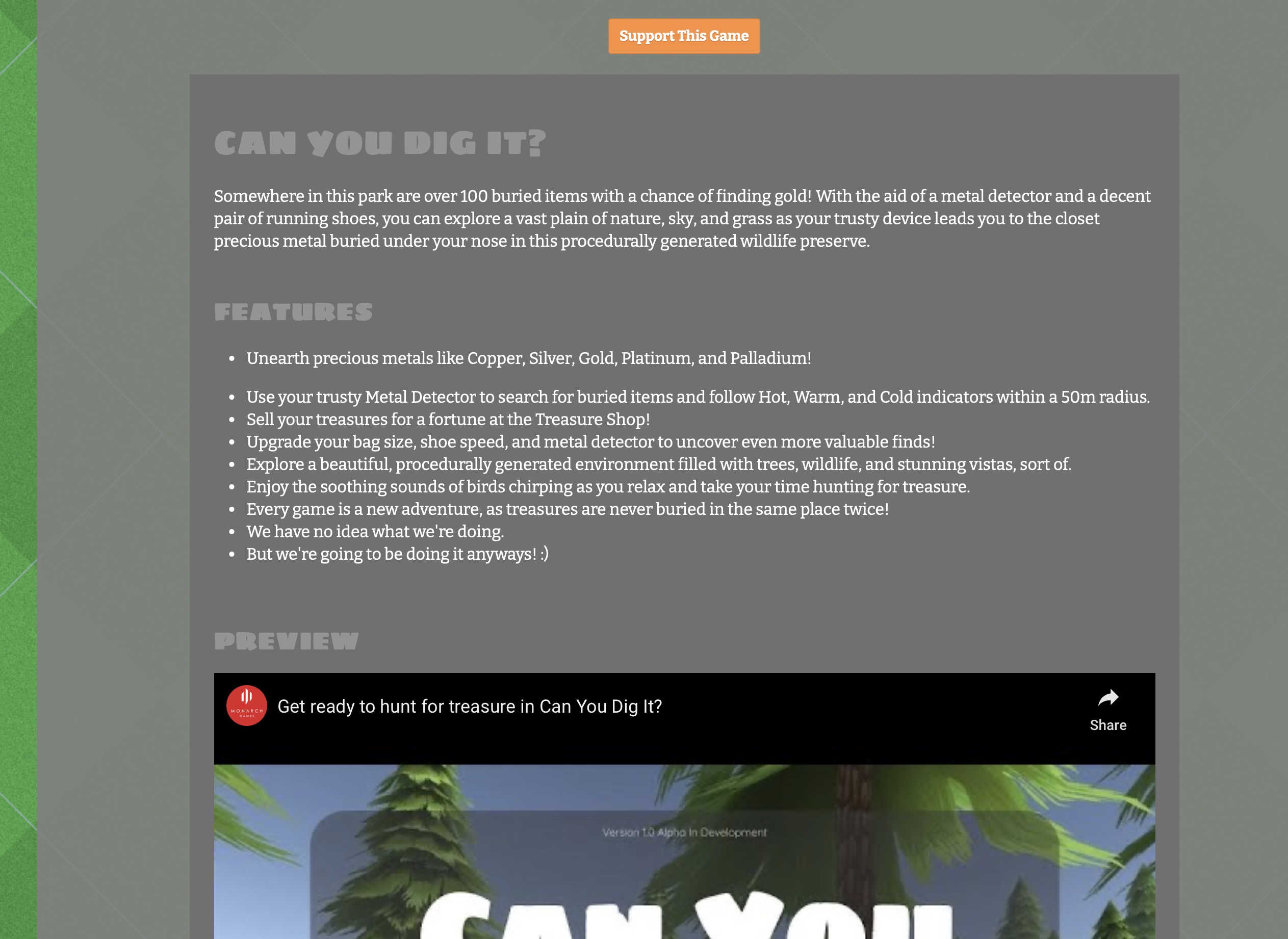 Lastly, we ventured into a huge makeover for our game site. Thanks to itch.io, we got permission to upgrade the look of our page.
This is going to make our weekly updates much easier, in the comings weeks you'll see this evolve further.
You'll notice from previous blog entries to now, we removed all the extras about other projects and added them to the front page. Now we can focus on updating content without clutter. Let us know your thoughts, do you like the new format? Are there changes we should make?
TASK TRACKER GOLD IN TWO WEEKS

Visit Task Tracker's Public TODO List and sign up FREE!
One more thing, we are ALMOST done with Task Tracker. GOLD is about to happen in 14 days. Afterward we'll be switching to CalorieRPG, our fitness role-playing game where you track your points and level up while you log your food. We'll be posting more about that soon.
Can You Dig It? (Yes You Can)
The treasure game of finding buried riches under Fortune Park's vast terrain with aid of a trusty shovel and detector!
| Status | Prototype |
| Author | Monarch Games Net |
| Genre | Simulation, Puzzle, Strategy |
| Tags | Exploration, First-Person, Indie, nature, Open World, Sandbox, treasure |
More posts
- (Week 56) IN THE BAGJan 24, 2024
- Week 56 - Progression Makes Perfect!Jan 23, 2024
- (Week 30) JACKPOTJul 09, 2023
- (Week 28) Á LA KARTJun 25, 2023
- (Week 27) SWEAT AND TIERSJun 18, 2023
- (Week 26) DETECT: THE ALMIGHTYJun 11, 2023
- (Week 25) UPGRADES UP-DATE!Jun 04, 2023
- (Week 24) SHOE BETCHAMay 28, 2023
- (Week 23) LET'S COALESCE??May 21, 2023
Leave a comment
Log in with itch.io to leave a comment.