(Week 9) FANCY NEW LOOK
SUMMARY
- NEW USER INTERFACE (VIDEO): game uses fresh, new, design from our guide.
- LIFE-SIZED TREES: Yup, they're big!
- DEMO RELEASE NOW VS. LATER: Should we share our demo now or later?
- SOUND: We have bird chirps to make it feel more ... chirpy!
- SECRET SURPRISE: we have an unoffical update about another thing.
Progress, not perfection: NEW UI
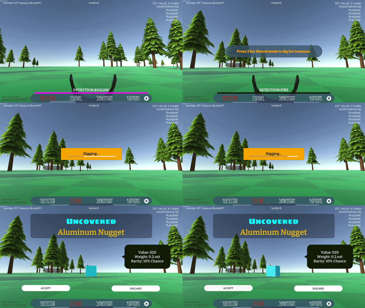 Last week, we showcased a lot of our design guide fonts, colors, and shapes. Then we panicked and realized too
much time was spent obsessing over art versus gameplay. While it looked pretty, we knew it was time to push forward and move on.
That's why this week, we proceeded with what we had and started integrating the new UI into the game! Progress, not perfection, that should be our motto. But looking through our color and shape palettes, there were so many options, yet so little time, it was hard to choose.
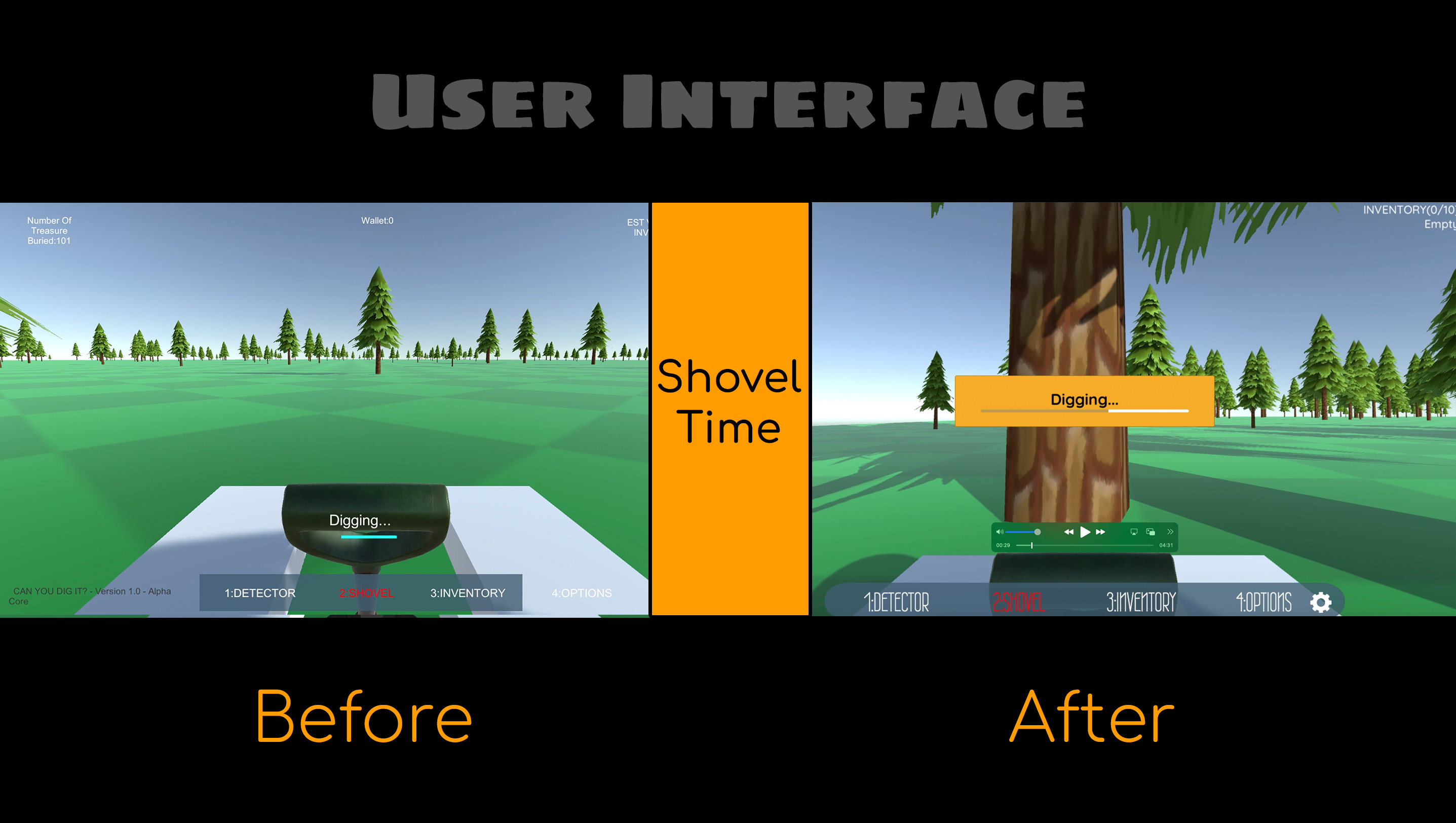
Let's admit art can become a black hole. That's why it's been decided to move forward and polish as we go. Your feedback helps determine a lot of what improves going forward anyways.
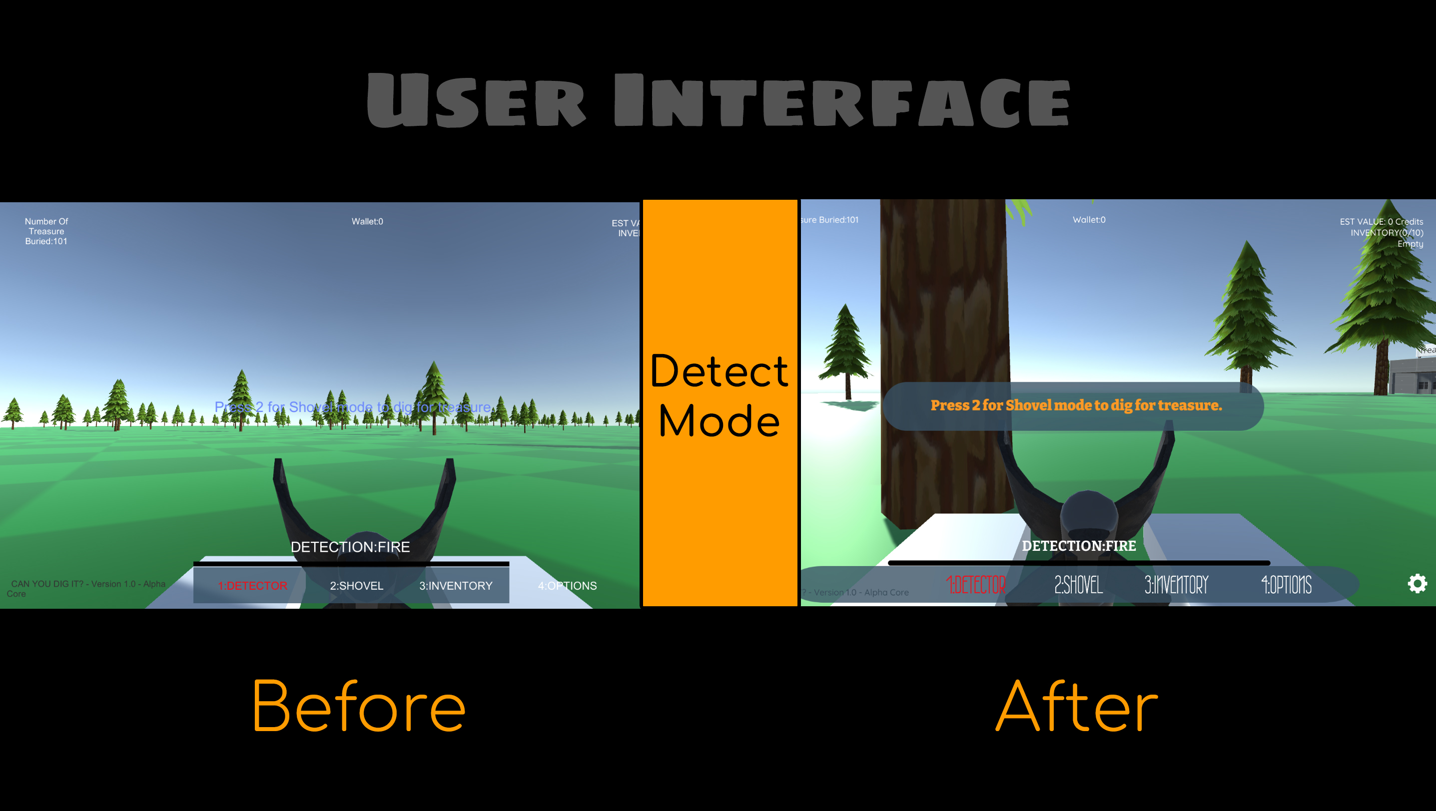
Strategic cutoff, that's what I want to call what happens whenever a dark void of foreverness starts to creep, especially with art, and then it's time to set boundaries around that sink hole. In our case, we had to think about what was most important along with what could be accomplished within a set time, and tackle only those for the moment.
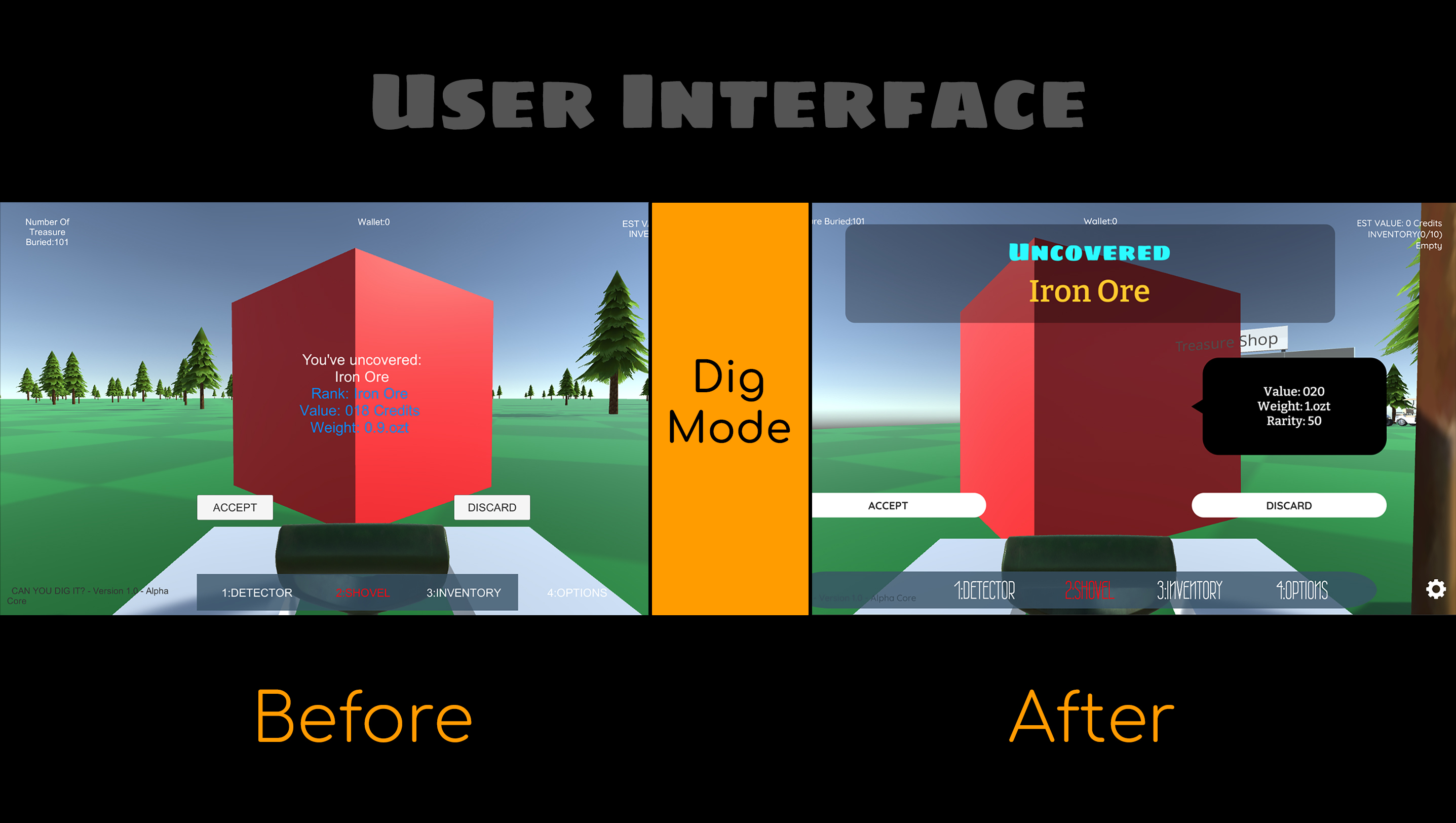
Was it worth it? Should we have waited? Was it time to move on? Did we do enough? Was it too much? Check out our video and decide if you agree or disagree. Leave us a comment!
Important Lesson: Don't Gloat, avoid bloat
Beware! It's easy to get caught up in details and lose the (no pun intended) the forest from the trees. It's important to remember at the early stages of any app, to remain faithful to the core. It's easy to fall into bloating or overdeveloping one aspect and as a result, the entire project ends up lopsided.
It sadly happened with Star Kingdom. A friend of mine gave advice I took too seriously and I ended up derailed by six months working on what amounted to Star Craft battles in space. The result proved fatal.
The project was fun without it. One tester even said we should kill the space battle section which makes up a good third of our project's resources yet accounts for only 5% of the game's play time. Don't make the same mistake, don't overdevelop any one area of your project or game, be careful with your time and resources.
Life Sized Trees

(I hope he's not kissing that tree. I love foliage but that might be taking it a bit far.)
We have giant foliage in our game. According to national park statistics the Lodgepole Pine is one of the most prevalent in North America. In fact, pine trees are the most common in the world, but the Lodgepole Pine will serve as our main reference for the game going forward.
It's also nice to have a sense of authenticity. At some point we'll add vareity, texture, and nuance. But as we talked about earlier, gameplay first, visuals later, good enough will have to be good enough for now.
As for the average height, they're about 70 to 80 feet or 21 to 25 meters roughly. That's why we scaled them in our prototype to around that size. It helps to make sure we have an honest sense of scale, even at an early stage, since it's easy to get used to the wrong measurements and later on we end up regretting it.
Demo: Now or later?
Should we share our demo now or later? I'll be taking a vote but we're at a crossroads. We have a demo that's playable, but it's not complete.
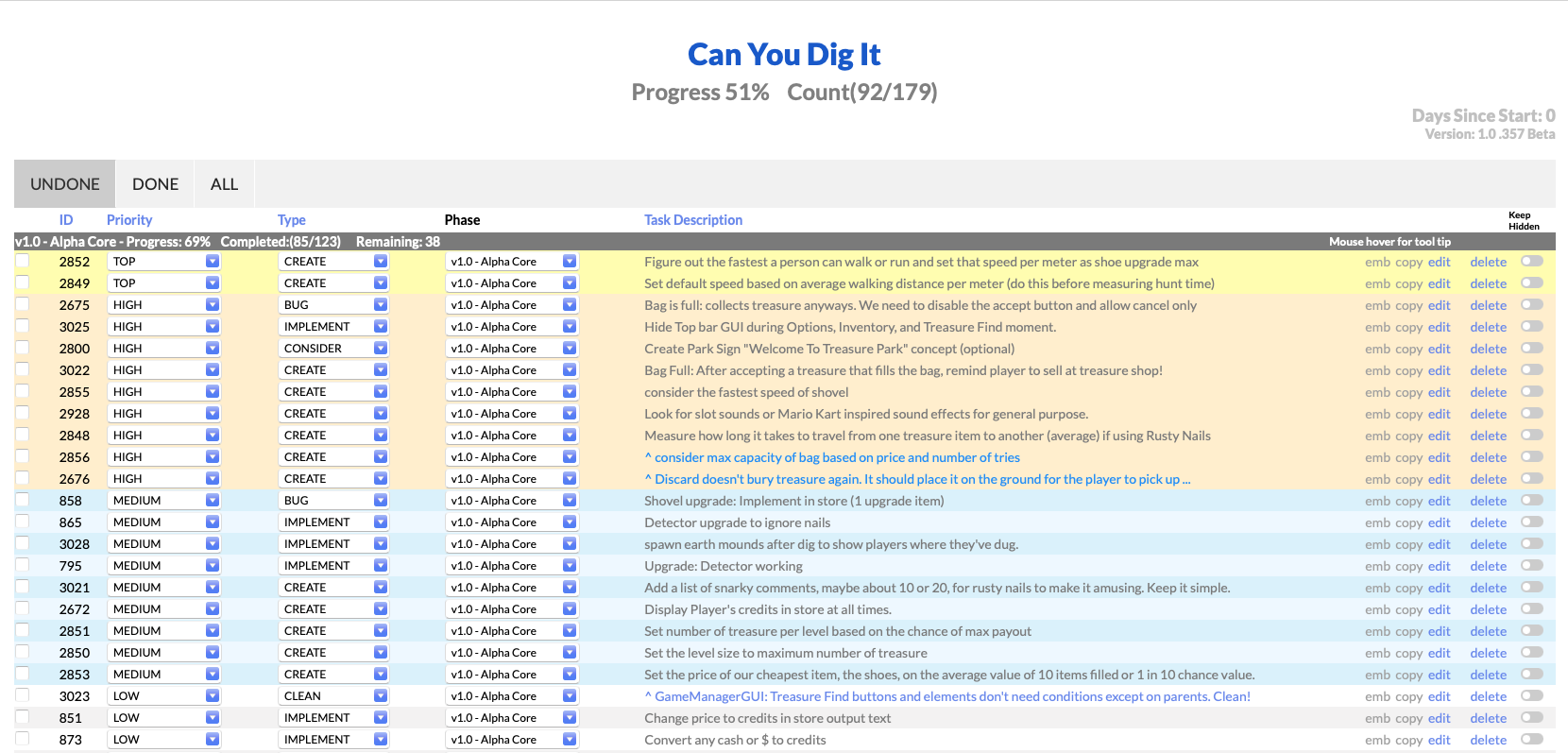
It's got bugs, the upgrades need work, and if you realy want to know what remains, above you see the whole list. Do you want to play this now anyways? It's fun but how much before we roll out for testing? Let us know in the comments!
Sound: License to Chill
We have chirpy chirps happening! Using the audio effect from freesound.org, it helps feel like an early morning walk in the park. While there's no music track yet, (any suggestions welcome) it was wondered if to compliment the chill mood with bossa nova hip hop? Here's a sample: Bossa Beat Sample. A few retro games like Mario 3 have been infamous for using bossa inspired tones (maybe).
Imagine you're having a bad day, you're upset, stressed, or sad. Then, you press start, let the game run, and for at least a good half hour you're able to calm, relax, take your mind off things and just ... chill. A conversation with former colleagues inspired the idea to aim for a relaxed interactive experience. If we can have that kind of effect and still reward with a sense of accomplishment, then perhaps this project has found it's true calling.
Supposedly, sound makes up 60% of one's experience with entertainment. I'm not sure if that's true but audio does have a greater impact than images. That's why now might not be the time to get invovled just yet. Noise can be fun or annoying, too many games suffer from it and we might end up with the same result. Forming a vision for where we want to go in terms of mood and vibe may help avoid this problem or minimize it. For now, we should aim for core mechanics and at least make sure at the barebones it's fun.
Confession: Task Tracker Pro Update
One more tiny thing that may not have been mentioned before. We're also the creators of Task Tracker Pro! It's the app used to track tasks and make strides with our game. Without it, we'd be lost and not have a sense of priorities.
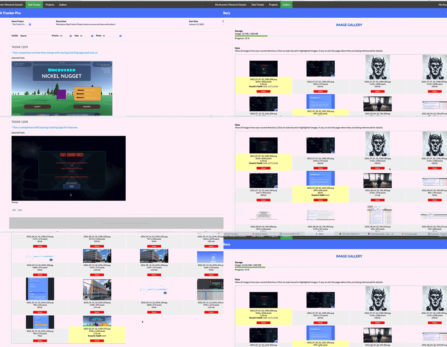
(here you can see the Gallery page working)
It's officially Beta so anyone reading this is free to try sign up and try it out. Wanted to also share it's been updated with a gallery which you can see here. It's great for seeing all your screenshots in once place and you can delete as well as keep track of which tasks they're being used. Click to zoom also has been implemented.
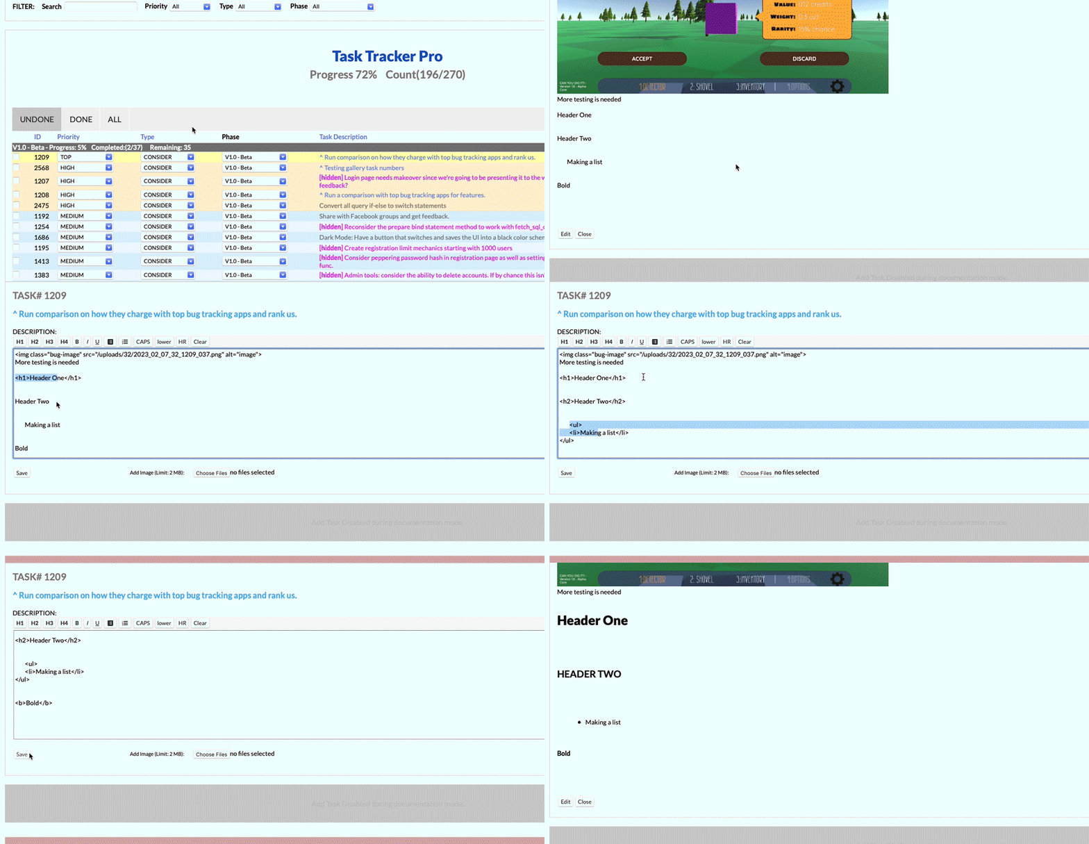
(here you can see the Markup toolbar update)
There's also our tag editor so you can highlight any text and set to header, bold, italic, make a list, or clear the whole thing and start over. It's easy to use and helps a lot with writing tasks in details. You can see an example of it above.
MORE TO COME, STAY TUNED
The demo continues to come along. The core is being refactored to make sure it's bug free. When is it rolling out? That may end up for you to decide! Should we roll out the demo now or later? Let us know in the comments!
Week 9 Demo: Check out our YouTube channel and subscribe for updates.
Task Tracker Pro Checklist: Check out our progress on Task Tacker Pro | Progress 49% Count(82/166) :
Star Kingdom GT Demo: Star Kingdom GT Demo (check out our other game, a space stratgey in the works)
Monarchgames.net: Our website (for more on what we're up to!)
More to talk about but until then, to be continued...
Can You Dig It? (Yes You Can)
The treasure game of finding buried riches under Fortune Park's vast terrain with aid of a trusty shovel and detector!
| Status | Prototype |
| Author | Monarch Games Net |
| Genre | Simulation, Puzzle, Strategy |
| Tags | Exploration, First-Person, Indie, nature, Open World, Sandbox, treasure |
More posts
- (Week 56) IN THE BAGJan 24, 2024
- Week 56 - Progression Makes Perfect!Jan 23, 2024
- (Week 30) JACKPOTJul 09, 2023
- (Week 28) Á LA KARTJun 25, 2023
- (Week 27) SWEAT AND TIERSJun 18, 2023
- (Week 26) DETECT: THE ALMIGHTYJun 11, 2023
- (Week 25) UPGRADES UP-DATE!Jun 04, 2023
- (Week 24) SHOE BETCHAMay 28, 2023
- (Week 23) LET'S COALESCE??May 21, 2023
Leave a comment
Log in with itch.io to leave a comment.