(Week 8) ART GUIDE BORN, ON TO GAMEPLAY!
SUMMARY
- VIDEO (FINALLY): I'm not proud because it would be ideal to integrate the latest concept, but you'll get the idea and we'll be integrating in coming weeks.
- LIMITS ARE YOUR FRIEND: Direction is all about simple rules you stick with. Once you make 'em don't break 'em. This will lead to the most creative outcomes.
- ART IS ALL ABOUT PRIORITY: Pick the most important thing. Then design, build, and create around it. Can't figure out what? Then you've got hard choices to make.
- ART DIRECTION & DESIGN GUIDE DONE (KINDA): Thanks to your feedback, we've gotten far enough but can't allow it to bog us down.
- GAME VS GRAPHICS: Without play feedback, who knows what element needs to stand out? We need to make design lead art, not the other way around.
- COLOR AND ART GUIDE PART ONE: Week 7 Design Guide Click Here for more
CLICK HERE TO PREVIEW FULL ART GUIDE
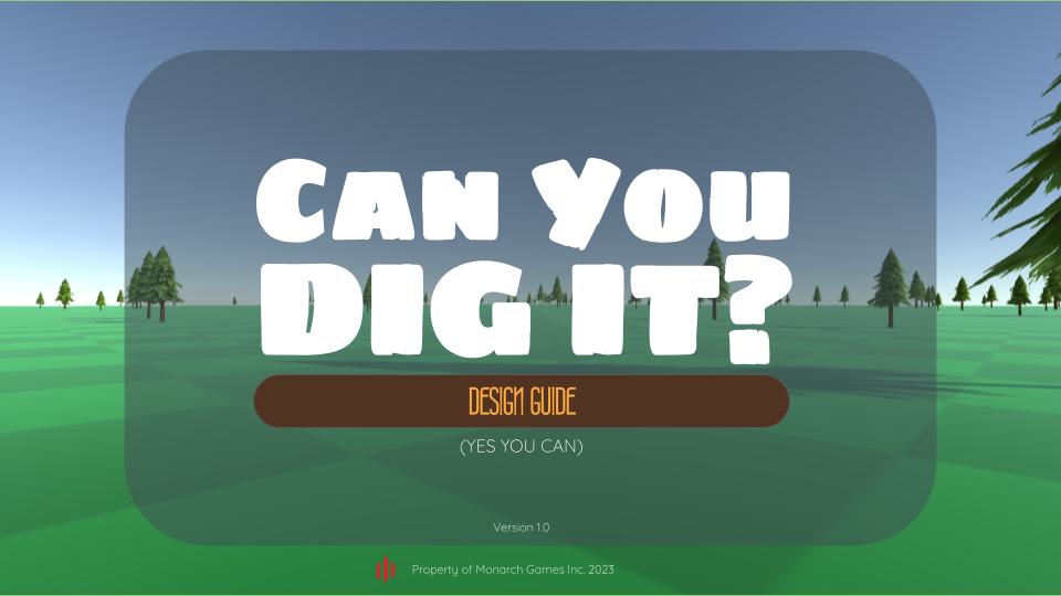
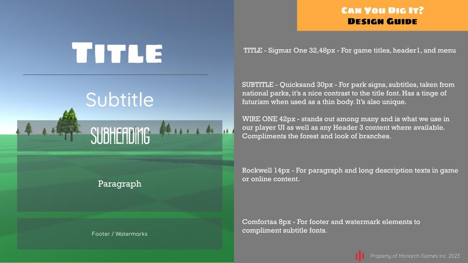
We have a design guide! But I'm ashamed to admit we lingered too long on it. We've been working on art for weeks and it's not even close to being done.
ART DIRECTION: PRIORITIZE ONE BOLD DECISION AND LET ALL ELSE FALL IN PLACE
We need to move on and get the prototype out there but on the bright side, some important lessons were learned. The greater admission of guilt is that it won't be until the game ships and it's an ongoing process. Unless playtesting occurs, we don't know what element is most important.
Make one bold decision and let all else fall into place. That is what great art style is all about: priority. It's hard to do but when you pull it off, it's so awesome.
Most folks aren't willing to work a simple thing like a light, font, color, type size, or shape to death. It's exhausting. But you should if you want it to be amazing yet it takes time. There are full time graphic artists who do this kind of thing for a living, we should stop trying to be one of them. (it's tough)
Whatever happens, limit yourself, and don't break your own laws unless you have to as a last resort. The key is to come up with a rule, keep it simple, and stick with it. Doing so leads to immense creative choices and everything feels tied together. Your style becomes born, limits are your friend!
Start Menu
The start menu has two options.
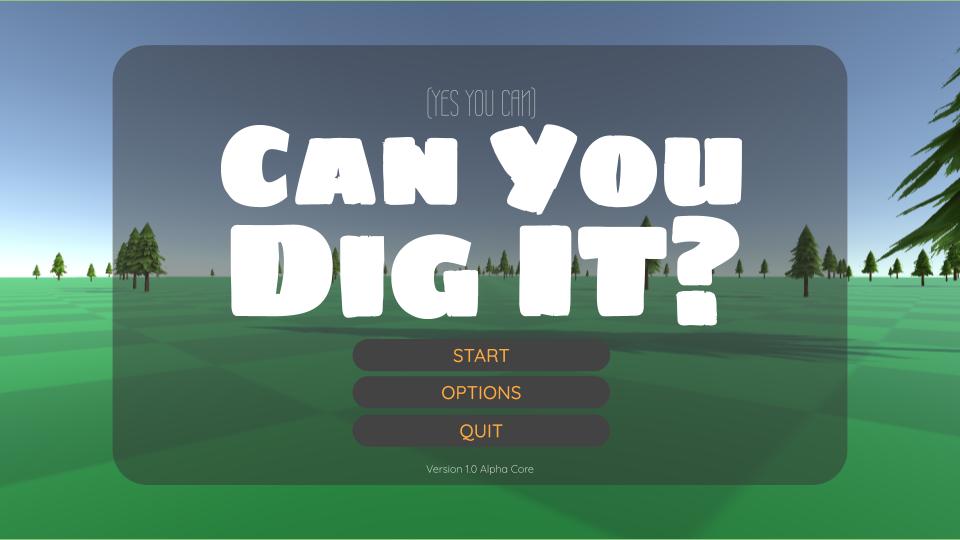
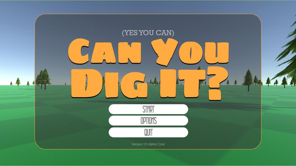
I've been playing with different combos from our guide. It's hard to choose and will be an ongoing process. We'll have to try them out in game and see which works best. Which one do you feel is better?
Treasure Find
This is the menu design for when you find treasure.
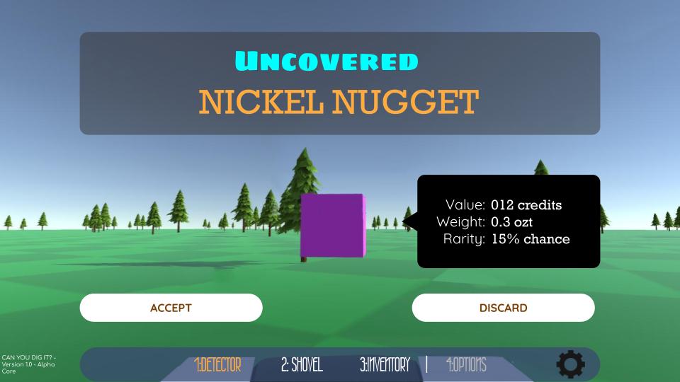
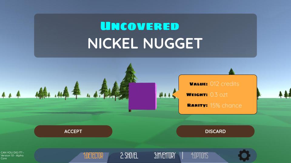
Which of these do you think is the best? It's hard to choose but at least they all have this in common: you know what treasure you're getting! What's missing is the top HUD showing your credits and overall progress.
Inventory
Inventory screens have been the toughest to figure out.
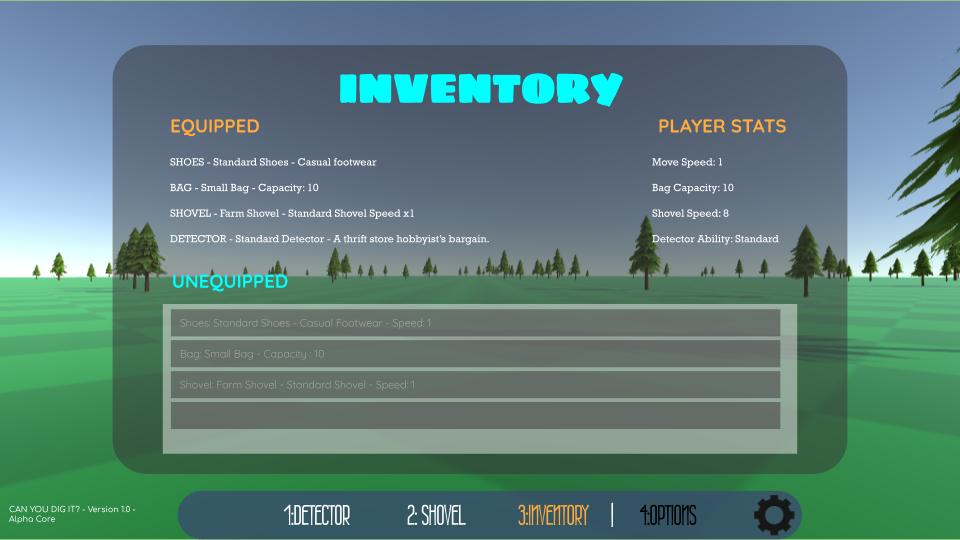
We definitely want Player stats to stand out but it's hard to say looking at these from far away.
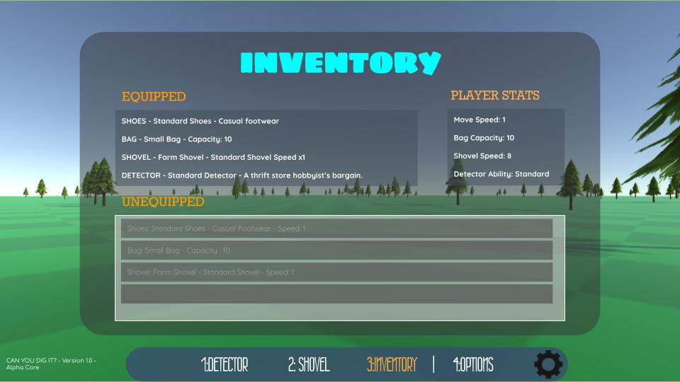
That's why once we get these in and tested in actual gameplay, it'll be tough to say what works or not. What do you think?
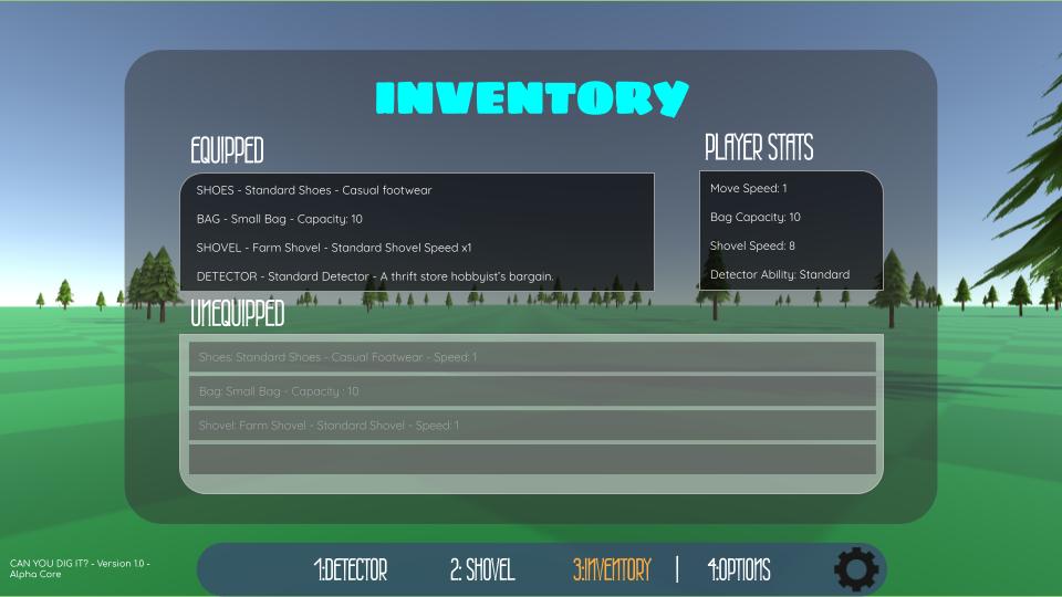
I like the background on this one.
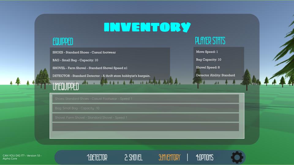
I like and hate all of them. This is an example of art that will probably be ongoing while testing. Once feedback arrives we'll get a better since of where to go with this, or if we even need it at all.
Options
So many option menus, so little time!
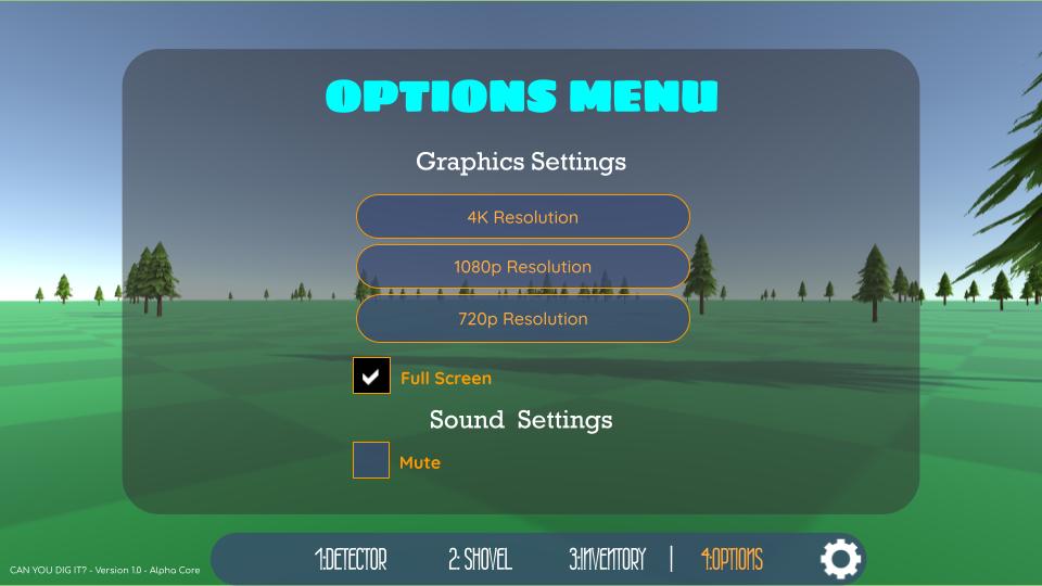

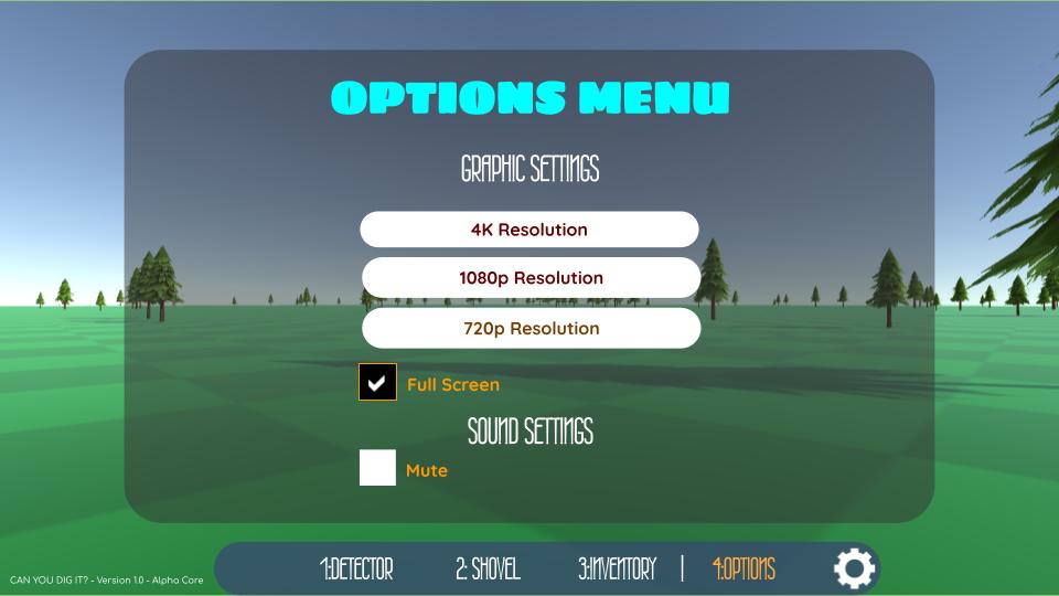
Honestly, they're all ... fine. It's hard to choose. Again, once testing commences or when we see it in the game, maybe then we'll know what to do.
Bottom HUD

It's been a long process to figure out the HUD design.
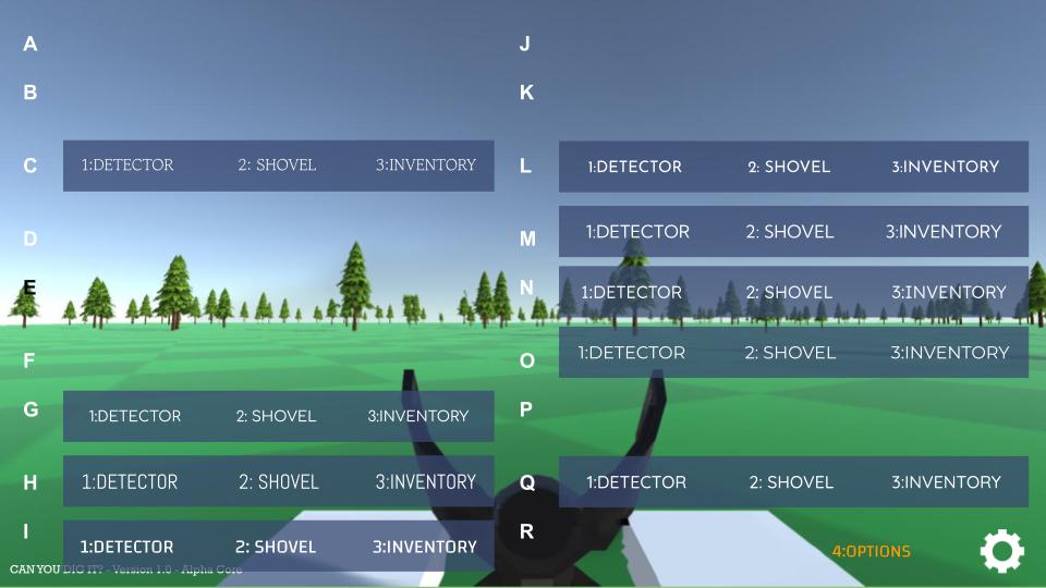
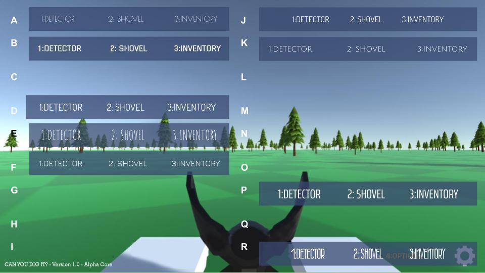
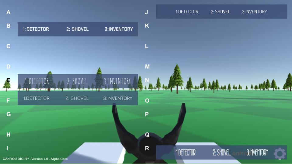
I wanted to font used for it to be more iconic or rather stand out to be something easily or instantly recognizable. While not final, the one we ended up with might end up close.
MORE TO COME, STAY TUNED
The demo continues to come along. The core is being refactored to make sure it's bug free. When is it rolling out? Not sure but soon (hopefully). More ideas keep piling up. For details, check out our task tracker list.
Task Tracker Pro Checklist: Check out our progress on Task Tacker Pro | Progress 49% Count(82/166) :
Star Kingdom GT Demo: Star Kingdom GT Demo (check out our other game, a space stratgey in the works)
Monarchgames.net: Our website (for more on what we're up to!)
More to talk about but until then, to be continued...
Can You Dig It? (Yes You Can)
The treasure game of finding buried riches under Fortune Park's vast terrain with aid of a trusty shovel and detector!
| Status | Prototype |
| Author | Monarch Games Net |
| Genre | Simulation, Puzzle, Strategy |
| Tags | Exploration, First-Person, Indie, nature, Open World, Sandbox, treasure |
More posts
- (Week 56) IN THE BAGJan 24, 2024
- Week 56 - Progression Makes Perfect!Jan 23, 2024
- (Week 30) JACKPOTJul 09, 2023
- (Week 28) Á LA KARTJun 25, 2023
- (Week 27) SWEAT AND TIERSJun 18, 2023
- (Week 26) DETECT: THE ALMIGHTYJun 11, 2023
- (Week 25) UPGRADES UP-DATE!Jun 04, 2023
- (Week 24) SHOE BETCHAMay 28, 2023
- (Week 23) LET'S COALESCE??May 21, 2023
Leave a comment
Log in with itch.io to leave a comment.