WHAT THE FONT? (Week 4)
Hey everyone!
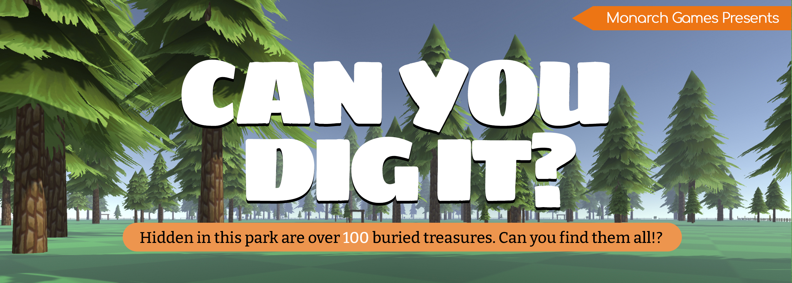
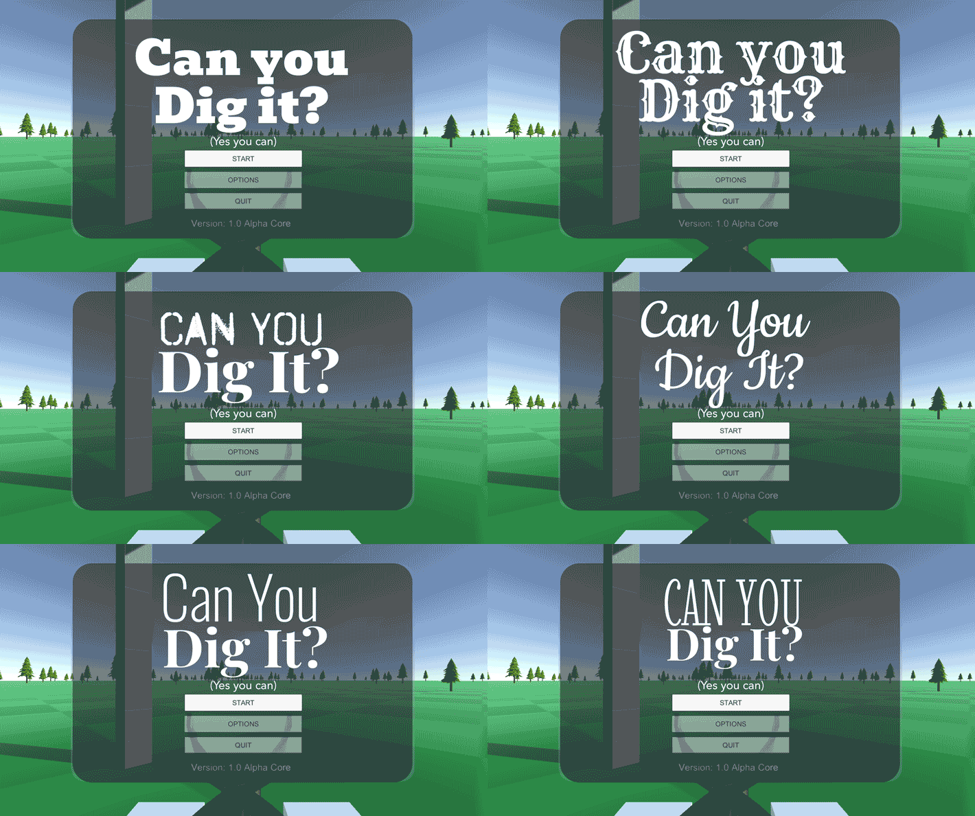
This week I've been on the hunt for the perfect font for our game to match our new title.
Up to this point I've kept it boring on purpose. It's been a
longer process than anticipated, but I believe it's worth taking the time to find the
ideal typeface for our project. I've also started obsessing over mechanics, balance, paytables and the luck of the draw. There will be math! (Feel the wrath of the math.)
FINAL FONTASY
Choosing a font for a game is not a decision to be taken lightly, as it can greatly impact the player's experience and set the tone for the entire project. That's why it's important to take the time to consider your options and choose the best one for your genre. To narrow down my search, I looked at typefaces from a variety of sources that were inspired by the theme of our game, such as national parks, construction vehicles, metal detector logos, shovel logos, park store signs, and even casino hotels.
As research progressed, it was decided to break options into six categories:
- Modern
- Typesetting
- Classic
- Handwritten
- Future
- and Decorative.
It became harder and harder to choose, but it's a shame that I couldn't present the top six choices to everyone this week. However, I wanted to at least provide an update on my progress. The finalists will be top contenders from each category, making sure they're commercial free (which isn't easy). At the bottom are included links recommended when you want to find top choice fonts for your game.
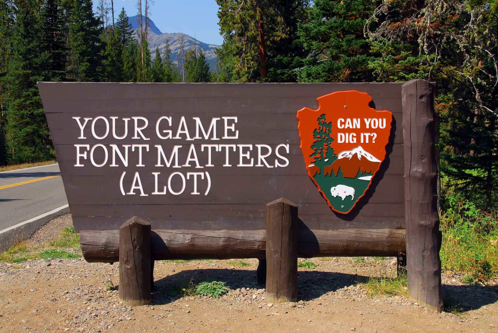
IN YOUR TYPEFACE
When choosing a font for your project, it's important to consider factors such as readability, genre and style appropriateness, and overall design enhancement. You should also consider the mood you want to convey and whether the font fits with the theme of your game. Taking your time to do it right pays off in the long run since it's not just your game's identity but it ties the UI, website, and dev log together. It makes your game easier to recognize, connect with, and get into.
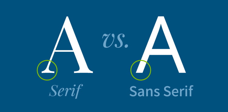
(Illustration above courtesy of Difference Between Serif & Sans-Serif | Clockwork Design Group Inc.)
One important consideration is the difference between serif and sans serif fonts. Serif fonts have small lines attached to the ends of their letters, while sans serif fonts do not. Serif fonts are generally considered more traditional and easier to read in printed materials, while sans serif fonts are more modern and easier to read on screens. Serifs give a classic feel which ties better with romantic and historical themes. San-serif (sans I guess means without stems?) gives a modern feel or futuristic look, ideal for action and sci-fi games.
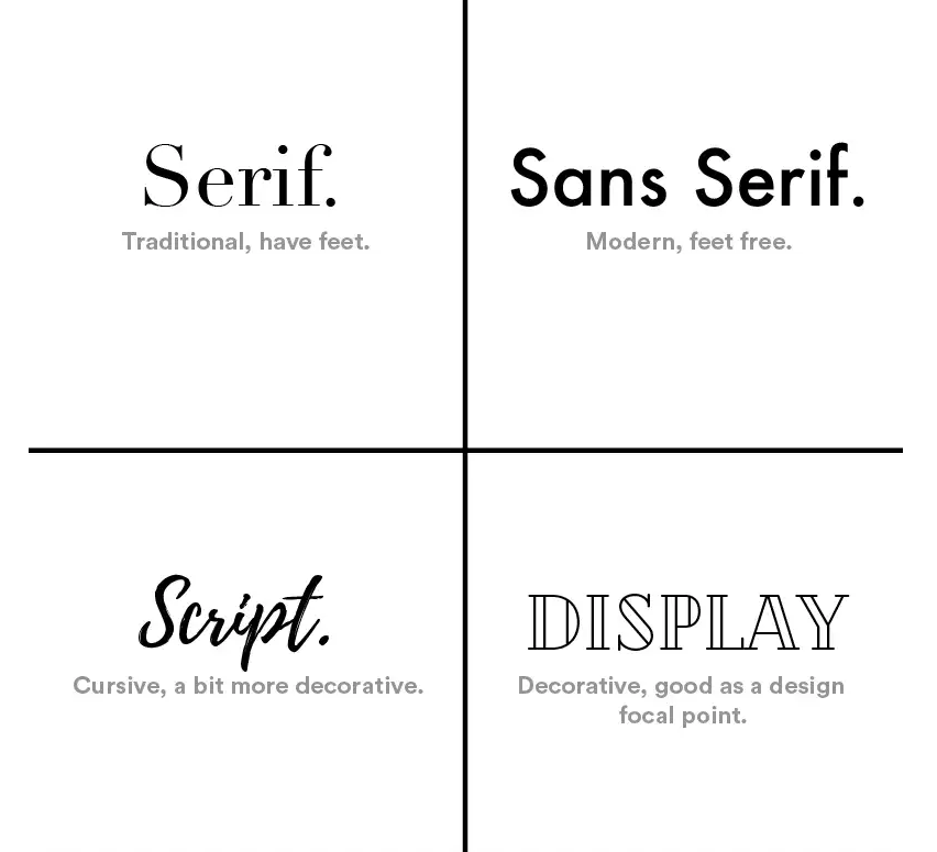
(Graphic courtesy of We always find our Type -Design Culture at MICA | by dsignosour | Medium)
In addition to serif and sans serif fonts, there are also display fonts and script fonts to consider. Display fonts are typically used for headlines and other large text, while script fonts are more suited for small amounts of text and have a more elegant, handwritten look. For example, a romantic game might benefit from a calligraphic font, while a sci-fi or action game might have better results with a font that has straight, hard edges and conveys a bit of personality. When it comes to your start menu, think about a title font to be as extravagant as you want as a display type but for the start, options, and save buttons, it may be ideal to stick with a script based.
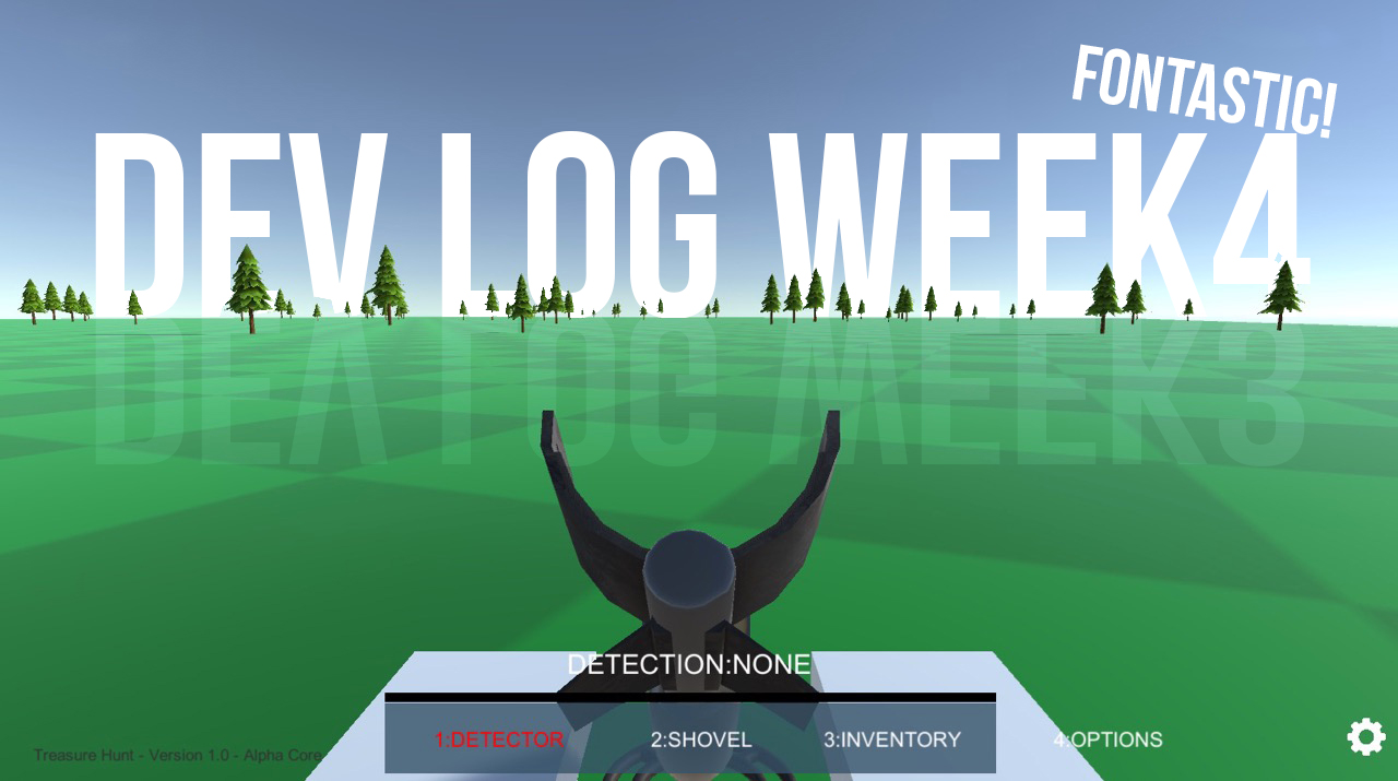
It's also important to choose a font that is appropriate for the intended audience. For example, a more playful and fun font might be suitable for a game aimed at children, while a more serious and professional font might be better for a business-oriented game.
LUCK OF THE DRAW
In addition to font selection, we've also been working on the game's chance and pay table. We want to make sure that the game is fun and balanced, so we've considered the price of items in the game relative to the chance of finding them. Below is an example of our paytable. The more tries you attempt, the more money there is to make.
But the question is whether or not it'll feel like you're making too much or too little? Is the payout worth it?
While we can break our game into probability and credits per try, until it's played and tested we won't really know.
In all of this, there's a lot of math to consider but it's worth it. Fun is a science as much as art!
This what we've got so far:
| Metal | Estimated number of tries | Time to find metal (minutes) | Cost | Chance of finding metal (%) |
|---|---|---|---|---|
| Rhodium (Osmium, rhenium, Iridium) | 10000 | 10000 | $10000 | 0.01% |
| Palladium | 5000 | 5000 | $5000 | 0.02% |
| Platinum | 2000 | 2000 | $2000 | 0.05% |
| Gold | 1000 | 1000 | $1000 | 0.1% |
| Silver | 500 | 500 | $500 | 0.2% |
| Nickel | 200 | 200 | $200 | 0.5% |
| Copper | 100 | 100 | $100 | 1% |
| Tin | 50 | 50 | $50 | 2% |
| Lead | 20 | 20 | $20 | 5% |
| Aluminum | 10 | 10 | $10 | 10% |
| Titanium | 5 | 5 | $5 | 20% |
| Iron | 2 | 2 | $2 | 50% |
| Rusty Nails | 2 | 2 | $1 | 50% |
| BAGS | Number of items | Cost |
|---|---|---|
| Basic | 10 | $20 ($82) |
| Deluxe | 20 | $50 ($164) |
| Premium | 50 | $410 |
| Ultimate | 100 | $820 |
| SHOVELS | Cost |
|---|---|
| Standard | $10 |
| Plus | $20 |
| Elite | ??? |
| Supreme | ??? |
I'm also struggle to figure out the price of all items in the game. Will it be too cheap, too expensive, and worth the effort to win? These are reinforcement mechanics that maximize replay so it's equally important to weight and consider. For now, I'm doing a first pass using whatever formula I can think of to see what sticks or makes sense. Again, it's going to boil down to play testing and feedback to get the ultimate answer.
I hope these choices will help to make the game fun and exciting
experience for all players.
Thank you for following along with our dev log. Hope you've enjoyed learning about
the process of choosing a font and about our chance and pay table.
Stay tuned for more updates on the development of Can You Dig It. We can't wait to share the
finished product with you.
More to talk about but we'll leave it for next week. Until then, to be continued...
FONTASTIC RESOURCES
If you're looking for good places to find game fonts, here are the ones I recommend:
Task Tacker Pro(50% complete) : https://tasktrackerpro.app/public-tracker.php?editmode=false&bugid=&usid=67616265406d6f6e6172636867616d65732e6e6574_33&project=Can_You_Dig_It
gabearts305
Can You Dig It? (Yes You Can)
The treasure game of finding buried riches under Fortune Park's vast terrain with aid of a trusty shovel and detector!
| Status | Prototype |
| Author | Monarch Games Net |
| Genre | Simulation, Puzzle, Strategy |
| Tags | Exploration, First-Person, Indie, nature, Open World, Sandbox, treasure |
More posts
- (Week 56) IN THE BAGJan 24, 2024
- Week 56 - Progression Makes Perfect!Jan 23, 2024
- (Week 30) JACKPOTJul 09, 2023
- (Week 28) Á LA KARTJun 25, 2023
- (Week 27) SWEAT AND TIERSJun 18, 2023
- (Week 26) DETECT: THE ALMIGHTYJun 11, 2023
- (Week 25) UPGRADES UP-DATE!Jun 04, 2023
- (Week 24) SHOE BETCHAMay 28, 2023
- (Week 23) LET'S COALESCE??May 21, 2023
Leave a comment
Log in with itch.io to leave a comment.